Build a business you love to lead. Create the life you want.
14 best practices for creating effective calls-to-action

You’ve created great content that’s attracting lots of website visitors… but do you know who they are or how to contact them again?
Calls-to-action (CTAs) are an important cornerstone of any lead generation strategy. They help persuade folks to take the action you want them to take, in order to move them further along their buyer’s journey.
Let’s take a deeper look at how you can create CTAs that actually drive the results you want.
What are CTAs and why do they matter?
Here’s how HubSpot defines it: “A call-to-action (CTA) is a button or link that you place on your website to drive prospective customers to become leads by filling out a form on a landing page.”
Basically, CTAs persuade your visitors to take a specific action. They guide your visitors through the marketing funnel by showing them the next steps they should be taking. As such, the best CTAs strategically direct people towards the information they need, when they need it.
And when people act on the CTA, that’s a conversion. You could say that that’s the holy grail of marketing: converting visitors to leads, and converting leads into customers.
How to create CTAs that drive results
 Every marketer wants to see high conversion rates — which means high click-through rates (CTR) for your CTAs. Here are 14 best practices that will help you start introducing persuasive CTAs to your website.
1. Offer something relevant
At the most basic level, your CTA needs to have a strong relationship with whatever’s on the actual page — as well as the motivations of the people who might be viewing that page.
As one example, if the CTA is at the end of a blog post discussing a top-of-the-funnel concern (like a how-to guide), then it shouldn’t be asking your visitors to schedule a consultation with you just yet, because those visitors won’t be ready to buy.
As another example, if the blog post is a how-to guide on editing your writing, you might not want to include a CTA to an eBook on mastering Final Cut Pro.
2. Write action-oriented text
It seems obvious that a call-to-action should be action-oriented — but you’d be surprised!
To get technical, your CTA should include a verb that explicitly states what the reader is supposed to do. Think about the marketing emails you get that urge you to “read more,” “download,” or “reserve.”
(But whatever you choose, please don’t use “submit.” Nobody wants to “submit” to your lead-gen campaign — “submitting” was what we did with our academic papers in college.)
3. Highlight the benefits
Okay, your readers now know what you want them to do — but why should they do it?
People can be pretty selfish. We don’t like to do things unless we know what’s in it for us. For this reason, your CTA should clearly state the benefits of clicking through.
So tell folks exactly what they’ll get in return. Instead of just saying “download my eBook,” describe the payoff — like “get better at writing!” or “improve landing page conversions!”
4. Set realistic expectations
In that same vein, people may be deterred from completing an action if they think it’s going to take a long time. Who hasn’t decided to “buy now,” only to realize that it takes 10 minutes to get through the process — and consequently given up?
This tactic is especially effective if you’re asking people to do something that requires some time or effort. People are more likely to stick through your registration process if they know it’ll take only 30 seconds.
5. Create a sense of urgency
FOMO is real: Nobody likes missing out on good things.
People will be more likely to take quick action if they think waiting will result in a lost opportunity. For example, if there are just a couple of seats left in your webinar, your call to action is more urgent. If a discount code is due to expire tonight, more people will be inclined to “shop now.”
6. Get personal
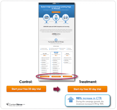
Don’t be afraid to use the first-person point-of-view in your copy. It offers people a sense of ownership, and helps them to feel more connected to the product or service.
A study by Unbounce and ContentVerve found that simply changing the copy from the second-person perspective (“you/your”) to the first person perspective (“my”) increased conversions by a whopping 90 percent.
7. Establish a timeline to follow through
It’s incredibly frustrating to fill out a form to get in touch with a sales rep — only to have the company follow up two weeks later. (Not to mention, your lead will probably have moved on by that point.)
Tell leads when they can expect to get what they asked for, and actually deliver within that timeframe. If you claim that folks can “download my eBook now,” your thank-you page and follow-up email should offer a download link immediately.
8. Keep your copy concise
So far, we’ve offered seven suggestions for optimizing your CTA copy. You might be wondering, “How do I use all of these tips without writing the longest copy ever?”
…yeah, we don’t recommend using “Download my eBook now by filling out a form in 10 seconds to immediately improve my editing skills” either.
We recommend using no more than seven words, which means you’ll need to choose the elements that will make your content offer sound most enticing. Ask yourself: What’s the most compelling benefit that your readers need to know?
In any case, you can always add important information near the CTA to complement the CTA copy. For example, if you’re looking to highlight the easy registration process, you can write “it only takes 30 seconds!” beneath the button itself.
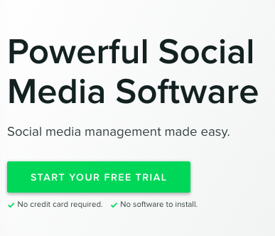
 Here’s how Sprout Social communicates additional information without squeezing it all into the CTA button.
9. Use strong, contrasting colors
With that, we’re ready to move forward with the actual design of your CTA!
For starters, you want your CTA to be visually striking and easily noticeable. You want people to see it, which means you don’t want it to blend into the rest of your page.
So choose an eye-catching color for your CTA. Try to steer clear of your brand colors — in fact, we recommend choosing a color that sharply contrasts with the existing colors on the page.
 The CTA on the right saw a 21 percent higher click-through rate — because red contrasts strongly with the brand’s base colors.
10. Size appropriately
On the one hand, your CTA can’t be too small, or else it won’t attract anybody’s attention.
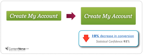
On the other hand, your CTA can’t be too large, or else it’ll distract from the main content on the page — and unintentionally pressure folks into taking the action. In one example, making a bigger CTA actually decreased conversions by 10 percent.
So while you’ll want to go big with your CTAs, you don’t want to push their size to the extreme either! Size your CTAs relative to the pages on which they live.
11. Use white spacing
Don’t surround your CTA with other text and images — those only distract from your CTA’s core message. By keeping a reasonable amount of white space around the CTA, you ensure that it stands out on the page.
12. Use strategic page placement
Your CTA should appear in strategic, sensible locations that align with your readers’ experience. People will find it jarring — and will consequently be less inclined to click — if a CTA appears in an unnatural location and interrupts their reading process.
Typically, CTAs can be found after an appropriate in-text reference (don’t ask your readers to sign up for a product trial before they’ve even read about the product!), in a sidebar, or else at the very end of a piece of content.
But there’s no definitive best position for a CTA; the best location will differ depending on how each piece of content is structured. We recommend A/B testing to optimize placement — more on that below.
13. Use directional cues
Everyone involved in marketing knows about that Kissmetrics eye-tracking study by now. You know, the one with the baby.
Basically, when the baby was looking at the copy, people paid more attention to the copy.
What this practically means is that you can use visuals to give readers directional cues towards the most important page elements. Call attention to your CTAs by using images of humans looking in their direction — or arrows that point toward them.
14. A/B test
There are lots of empirical best practices that you can follow, but ultimately different audiences will have different needs. Numerous studies have shown that the smallest change can have a huge impact on your results:
- After changing the font color, Unbounce saw its CTR decrease by 18.01 percent
- By changing just one word, GoCardless increased product demo conversions by 139 percent
What works for one CTA may not work in another context, which is why it’s critical for you to split test your CTAs. You want to optimize for the specific audience that your content appeals to.
Any robust content management system (CMS) should offer you tools for conducting A/B tests. Our go-to CMS is HubSpot — here’s their step-by-step guide to setting up an A/B test on their platform.
How can I boost my lead generation efforts?
Looking to increase the number of leads you’re getting from your website? You’ll certainly need compelling CTAs — but a great lead-gen strategy involves lots of other moving parts as well.
Our FREE lead generation eBook will walk you through the process of maximizing your website’s conversion potential. Download it now!
Recent Posts
UNLOCK YOUR POTENTIAL IN 30 MINUTES
👀 Seeking efficient solutions to the business, marketing, or mindset challenges you face?
🚀 Ready to take your business to the next level?
⏰ Short on time?
QuickWin Coaching is designed with you in mind. Why waste hours in lengthy coaching sessions when you can achieve remarkable results in a mere 30 minutes?


